- → Anika
- → Closable Toast Notifications
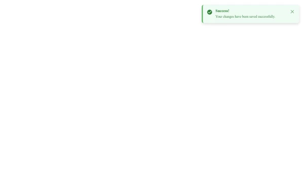
Closable Toast Notifications
A lightweight toast notification system that displays messages in the bottom-right corner of the screen with smooth animations and a close button for user dismissal.
This Example is contributed by Anika, on 19-Mar-2025. It is responsive. similar terms for this example are caution,Toast, Snackbar

Author Anika
Related Examples
-
 Customizable Toast Alert Component for Websites
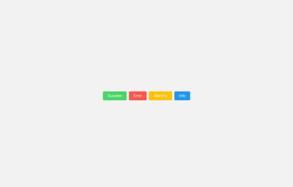
A versatile toast notification component that displays temporary messages to users with various styling options including success, error, and warning alerts.
9 months ago -
 Fixed Top-Right Alert Notification Component
A responsive fixed-position alert that appears in the top-right corner of the screen, providing important notifications without disrupting user workflow.
10 months ago -
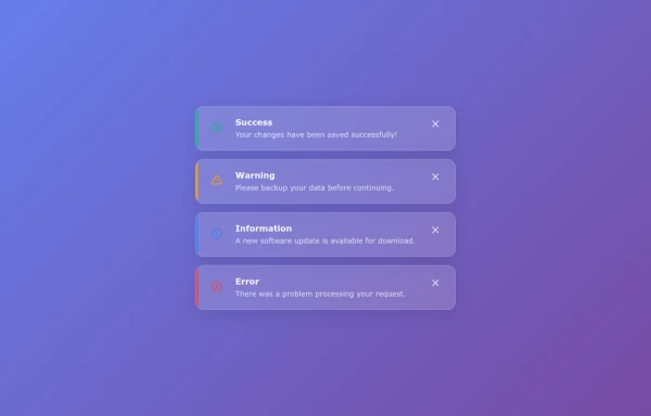 Glassmorphism Alert Component with Notification Icons
A glass-effect alert card with status icons that displays notifications in a modern transparent style, perfect for dashboards and admin panels.
9 months ago -
 Status Alert Component with CSS
A collection of clean, responsive alert components with success, error, warning, and info variants for web applications.
10 months ago -
 11 months ago
 -
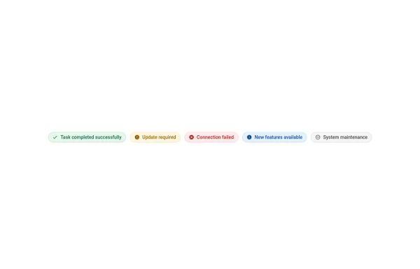 Information Chips with Custom Icons
A collection of sleek information chips with integrated icons that provide visual context for different types of notifications or statuses.
10 months ago -
 11 months ago
 -
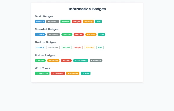 Badges designs
A collection of sleek, versatile information badges to display status, labels, and important information on your website or application.
10 months ago -
 10 months ago
 -
 11 months ago
 -
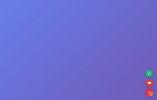 Fixed Contact Button Panel with WhatsApp Email Instagram Icons
A fixed floating contact panel featuring WhatsApp, Email, and Instagram buttons positioned at the bottom-right corner. Perfect for websites looking to boost user engagement and provide easy access to communication channels.
6 months ago -
 10 months ago


Explore components by Tags
Didn't find component you were looking for?
Search from 500+ components