- → Eliza Stone
- → FAQ Accordion: Expandable Q&A Sections
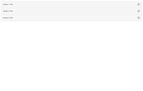
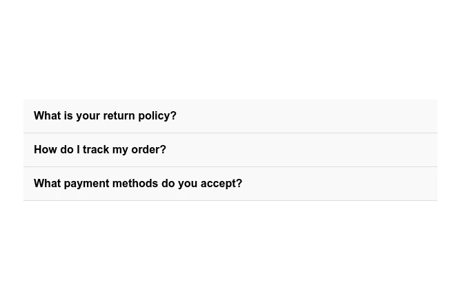
FAQ Accordion: Expandable Q&A Sections
This Example is contributed by Eliza Stone, on 22-Feb-2025. It is responsive. similar terms for this example are Frequently asked questions, QnA,collapsible

Author Eliza Stone
Related Examples
-
 Smooth Accordion-Style Collapsible Content
A lightweight, accessible collapsible content component that lets users show and hide sections of content with smooth animations.
11 months ago -
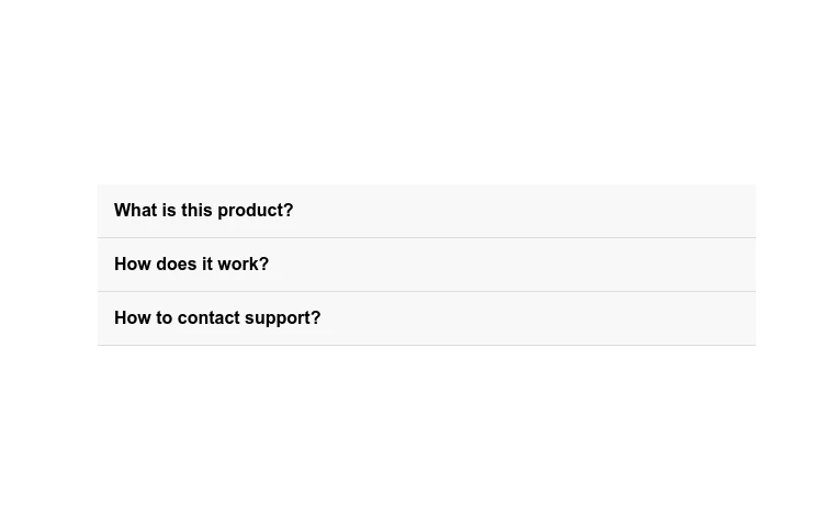
 FAQ Accordion
Enhance user experience with our FAQ Accordion, designed to provide quick access to answers. Expand and collapse sections to easily navigate through frequently asked questions, improving site usability and customer satisfaction.
11 months ago -
 Elegant Accordion Component
A clean and minimal accordion component perfect for FAQs, content organization, and enhancing user experience with smooth transitions.
11 months ago -
 FAQ Accordion
An interactive FAQ accordion component that allows users to easily expand and collapse frequently asked questions, improving user experience and site navigation.
11 months ago -
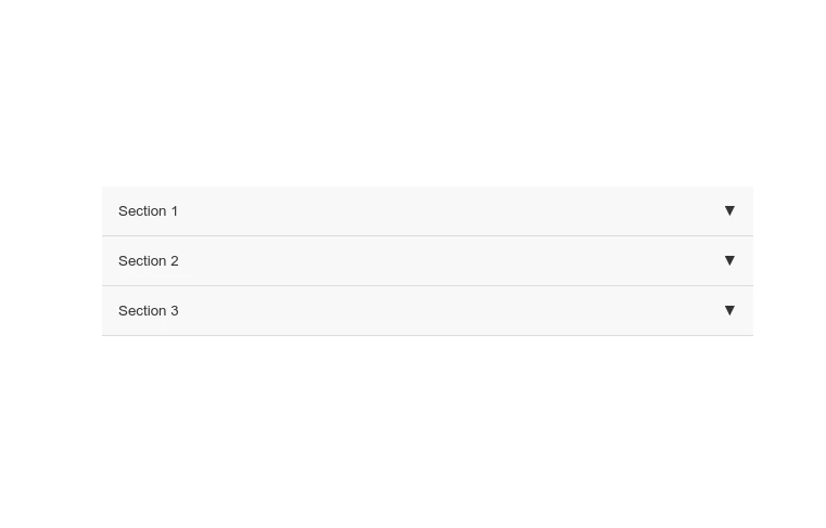
 Accordion - Expandable Content Sections
A clean and minimalist accordion component for elegantly displaying expandable content sections. Ideal for FAQs, product details, and organized information.
11 months ago -
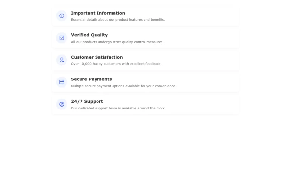
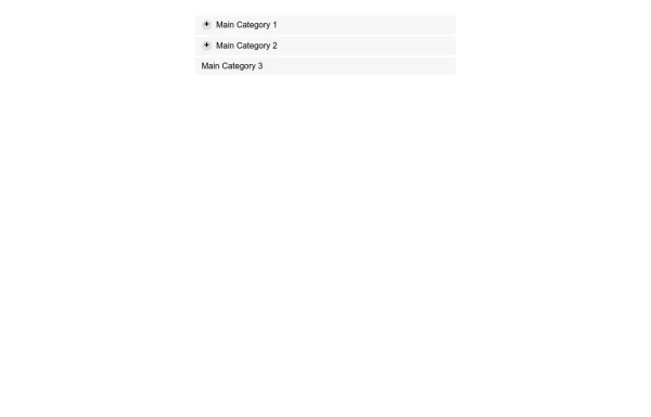 Interactive Expandable Nested List Component
A clean, interactive nested list component with expandable/collapsible functionality for organizing hierarchical data like categories, file structures, or navigation menus.
10 months ago -
 11 months ago
 -
 Interactive FAQ Accordion with Smooth Animations
Enhance your website's user experience with our dynamic FAQ section, offering expandable question-and-answer functionality.
11 months ago -
 11 months ago
 -
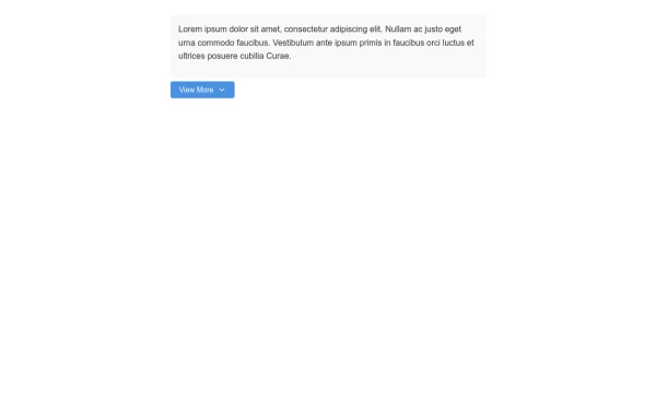 Expandable View More Button for Content Control
A customizable view more button that reveals additional content when clicked, perfect for managing long content sections without overwhelming users.
10 months ago -
 Elegant Responsive Header with Smooth Mobile Menu Transition
A professionally designed responsive header with a smooth-transitioning mobile menu that provides an excellent user experience across all devices.
10 months ago -
 Shrinkable Navigation Header with Responsive Menu
A shrinkable header that reduces in size when scrolling down the page, featuring a responsive navigation menu that transforms into a hamburger menu on mobile devices.
10 months ago


Explore components by Tags
Didn't find component you were looking for?
Search from 500+ components