- → Morgan
- → Header with Elegant Hero Section
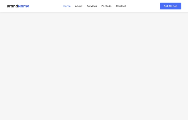
Header with Elegant Hero Section
A modern navigation header paired with a clean, impactful hero section perfect for business and portfolio websites.
This Example is contributed by Morgan, on 26-Feb-2025. It is responsive. similar terms for this example are CTA Button,CTA,banner

Author Morgan
Related Examples
-
 Elegant Responsive Header with Smooth Mobile Menu Transition
A professionally designed responsive header with a smooth-transitioning mobile menu that provides an excellent user experience across all devices.
7 months ago -
 Navigation Header with Mobile Menu Toggle
A beautiful responsive header with smooth transitions, featuring a hamburger menu for mobile and expanded navigation for desktop views.
7 months ago -
 7 months ago
 -
 Navigation Bar with Responsive Hamburger Menu
A modern, responsive navigation bar featuring smooth transitions, mobile-friendly hamburger menu, and subtle hover effects for enhanced user experience.
8 months ago -
 Hero with Image
Capture your audience's attention with a fully responsive hero section, optimized for all screen sizes. Includes a compelling headline, subtext, and a clear call-to-action button.
8 months ago -
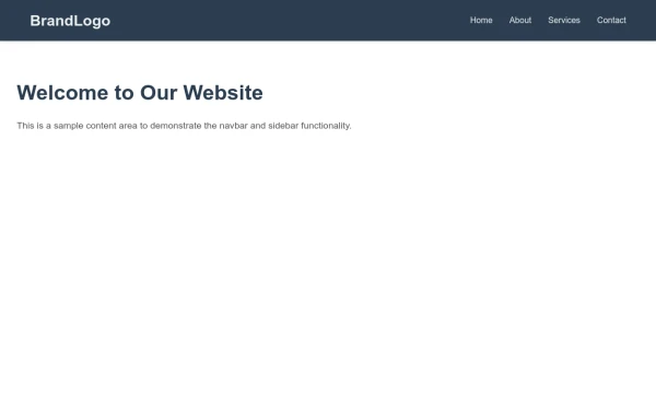 Brand Logo Navbar with Mobile-Friendly Sidebar Menu
A professional brand navbar featuring a logo, main navigation links, and a collapsible sidebar menu perfect for mobile and desktop websites. Includes smooth animations and responsive design.
2 months ago -
 8 months ago
 -
 Shrinkable Navigation Header with Responsive Menu
A shrinkable header that reduces in size when scrolling down the page, featuring a responsive navigation menu that transforms into a hamburger menu on mobile devices.
6 months ago -
 8 months ago
 -
 7 months ago
 -
 Responsive Navigation Bar with Dropdown
A responsive navigation bar with a dropdown menu for easy navigation on all devices. Includes smooth animations and accessibility features.
8 months ago -


Explore components by Tags
Didn't find component you were looking for?
Search from 500+ components