- → Avdhut Surkute
- → Brand Logo Navbar with Mobile-Friendly S...
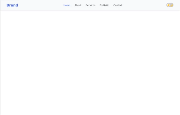
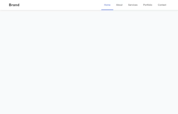
Brand Logo Navbar with Mobile-Friendly Sidebar Menu
A professional brand navbar featuring a logo, main navigation links, and a collapsible sidebar menu perfect for mobile and desktop websites. Includes smooth animations and responsive design.
This Example is contributed by Avdhut Surkute, on 27-Jul-2025. It is responsive. similar terms for this example is drawer

Author Avdhut Surkute
Related Examples
-
 Mobile-Friendly Navigation Bar with Toggle
A fully responsive navigation bar that transforms into a hamburger menu on mobile devices, providing seamless navigation across all screen sizes.
7 months ago -
 Responsive Navbar with Collapsible Sidebar and Dark Mode Toggle
A fully responsive navigation system featuring a sleek navbar that transforms into a sidebar on mobile devices, complete with smooth dark mode toggle functionality for enhanced user experience.
7 months ago -
 Right sidebar with CSS
A sleek animated navigation bar with a sliding indicator that follows the active menu item, creating a smooth and engaging user experience for your website.
7 months ago -
 Navigation Bar with Responsive Hamburger Menu
A modern, responsive navigation bar featuring smooth transitions, mobile-friendly hamburger menu, and subtle hover effects for enhanced user experience.
8 months ago -
 Mobile-Friendly Navbar with Collapsible Menu
A responsive navigation bar that transforms into a dropdown menu on mobile devices, optimizing screen space while maintaining full site navigation.
6 months ago -
 8 months ago
 -
 Elegant Responsive Header with Smooth Mobile Menu Transition
A professionally designed responsive header with a smooth-transitioning mobile menu that provides an excellent user experience across all devices.
7 months ago -
 Responsive Navigation Bar with Dropdown
A responsive navigation bar with a dropdown menu for easy navigation on all devices. Includes smooth animations and accessibility features.
8 months ago -
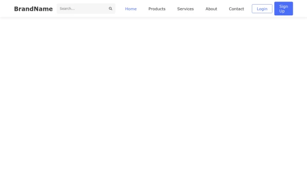 Responsive Navigation Bar with Dropdown Menu
A responsive navigation bar featuring dropdown menus, search functionality, and mobile-friendly toggle for seamless website navigation across all devices.
7 months ago -
 7 months ago
 -
 8 months ago
 -
 Responsive Navigation Bar with Dropdown
A responsive navigation bar with a dropdown menu for easy site navigation on any device. Includes smooth animations and accessibility features.
8 months ago


Explore components by Tags
Didn't find component you were looking for?
Search from 500+ components