- → MD. Tayyub
- → Responsive Navigation Bar with Dropdown
Responsive Navigation Bar with Dropdown
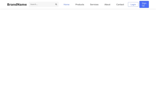
A responsive navigation bar with a dropdown menu for easy site navigation on any device. Includes smooth animations and accessibility features.
This Example is contributed by MD. Tayyub, on 13-Feb-2025. It is responsive.
Author MD. Tayyub
Related Examples
-
Responsive Navigation Bar with Dropdown
A responsive navigation bar with a dropdown menu for easy navigation on all devices. Includes smooth animations and accessibility features.
11 months ago -
11 months ago
-
11 months ago
-
Mobile-Friendly Navbar with Collapsible Menu
A responsive navigation bar that transforms into a dropdown menu on mobile devices, optimizing screen space while maintaining full site navigation.
10 months ago -
Responsive Navigation Bar with Dropdown Menu
A responsive navigation bar featuring dropdown menus, search functionality, and mobile-friendly toggle for seamless website navigation across all devices.
10 months ago -
Navigation Bar with Responsive Hamburger Menu
A modern, responsive navigation bar featuring smooth transitions, mobile-friendly hamburger menu, and subtle hover effects for enhanced user experience.
11 months ago -
Right sidebar with CSS
A sleek animated navigation bar with a sliding indicator that follows the active menu item, creating a smooth and engaging user experience for your website.
10 months ago -
Mobile-Friendly Navigation Bar with Toggle
A fully responsive navigation bar that transforms into a hamburger menu on mobile devices, providing seamless navigation across all screen sizes.
10 months ago -
Elegant Responsive Header with Smooth Mobile Menu Transition
A professionally designed responsive header with a smooth-transitioning mobile menu that provides an excellent user experience across all devices.
10 months ago -
Brand Logo Navbar with Mobile-Friendly Sidebar Menu
A professional brand navbar featuring a logo, main navigation links, and a collapsible sidebar menu perfect for mobile and desktop websites. Includes smooth animations and responsive design.
6 months ago -
Responsive Navigation Menu with Alpine.js Transitions
A responsive navigation menu that smoothly transitions between mobile and desktop views using Alpine.js for interactions and Tailwind CSS for styling.
9 months ago -
Responsive Navbar with Collapsible Sidebar and Dark Mode Toggle
A fully responsive navigation system featuring a sleek navbar that transforms into a sidebar on mobile devices, complete with smooth dark mode toggle functionality for enhanced user experience.
10 months ago
Explore components by Tags
Didn't find component you were looking for?
Search from 500+ components


