- → Anonymous
- → Responsive Flexbox Grid System with Tail...
Responsive Flexbox Grid System with Tailwind CSS
A responsive flexbox layout system built with Tailwind CSS that adapts to different screen sizes from mobile to desktop.
This Example is contributed by Anonymous, on 27-Mar-2025. It is responsive. similar terms for this example are Grid Display,CSS Grid,Grid,Card Grid

Author Anonymous
Related Examples
-
 Responsive CSS Grid Layout
Create a fully responsive grid layout using CSS Grid. Easily adjust the number of columns for different screen sizes.
6 months ago -
-
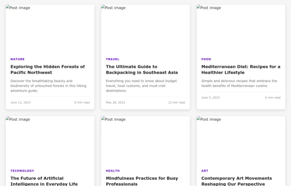
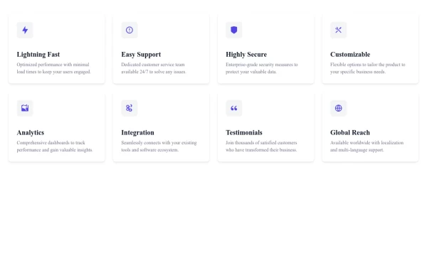 Responsive Feature Card Grid Layout
A responsive card grid system that adapts from 1 to 4 columns based on screen size, perfect for showcasing product features or service offerings.
5 months ago -
 Responsive Feature Grid Cards for Modern Websites
Showcase your product's key features with these responsive grid layout cards. Perfect for highlighting services, benefits, or product specifications on landing pages.
6 months ago -
 Feature Card Grid Layout
A clean, responsive grid layout showcasing product or service features with icon illustrations and descriptive text.
6 months ago -
 Feature Highlights Grid
Showcase your product's key features with this visually appealing grid layout of feature cards. Each card highlights a specific functionality.
6 months ago -
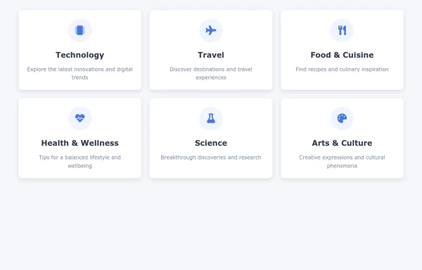 Topic Category Card Grid Layout
A responsive card grid system featuring clickable categories that adapt to different screen sizes, perfect for organizing and showcasing various content topics.
5 months ago -
 Team Section with Responsive Profile Cards
A responsive team section featuring profile cards with team member photos, names, roles, and social media links.
5 months ago -
 User Avatars Grid Layout
A responsive grid layout for displaying user avatars that adapts beautifully to any screen size, perfect for team pages or user directories.
5 months ago -
 6 months ago
 -
 5 months ago
 -
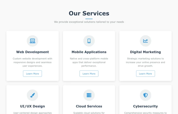 Feature-rich Services Grid for Company Websites
A responsive services component showcasing your business offerings with clear icons and descriptions, perfect for company websites.
5 months ago


Explore components by Tags
Didn't find component you were looking for?
Search from 500+ components