- → Anonymous
- → Toggle Switch Button
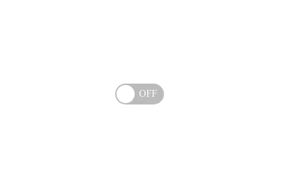
Toggle Switch Button
A simple and accessible toggle switch button for implementing binary on/off controls in your web applications.
This Example is contributed by Anonymous, on 18-Feb-2025. It is responsive. similar terms for this example are Theme Toggle,Toggle,Toggle Button

Author Anonymous
Related Examples
-
-
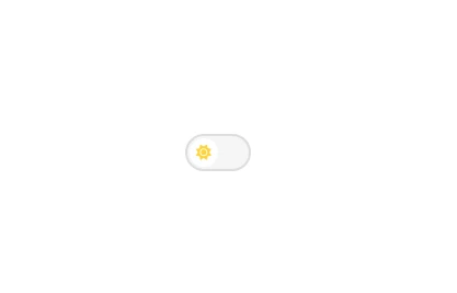
 Smooth Animated Toggle Switch Component
A customizable toggle switch with smooth sliding animation that provides visual feedback for on/off states, perfect for settings or preference controls.
8 months ago -
-

-
 10 months ago
 -
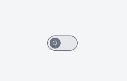
 Minimalist Theme Toggle Switch
A simple and elegant dark/light mode toggle switch component, perfect for modern web design. Seamlessly switch between themes with this lightweight, accessible, and easy-to-integrate UI element.
10 months ago -
 Minimalist Light/Dark Mode Switcher
Minimal and functional theme toggle, beautifully designed for both light and dark modes.
10 months ago -
 Minimal Light/Dark Theme Toggle Button
Minimalist design theme switcher with animated icons, perfect for modern web applications requiring dark mode functionality.
10 months ago -
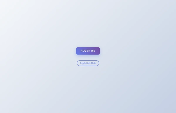 Tilted Gradient Button with Hover Animation
A responsive gradient button that tilts smoothly on hover with dark mode compatibility. Features smooth CSS transitions and gradient background effects.
6 months ago -
 Sharp Corner Button with Sleek Hover Animation
A clean, modern button design featuring sharp corners and a smooth hover animation that enhances user interaction and engagement.
8 months ago -
 9 months ago
 -
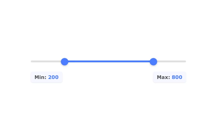 Range Slider with Min-Max Value Controls
A fully customizable range slider component with dual handles for selecting minimum and maximum values. Features real-time value display and smooth animations.
9 months ago


Explore components by Tags
Didn't find component you were looking for?
Search from 500+ components