- → David Wilson
- → Minimalist Theme Toggle Switch
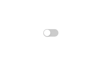
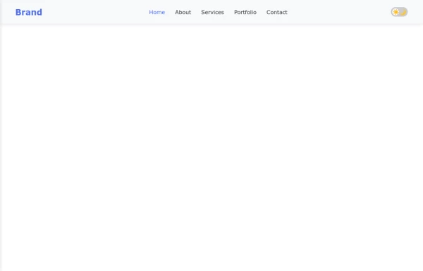
Minimalist Theme Toggle Switch
A simple and elegant dark/light mode toggle switch component, perfect for modern web design. Seamlessly switch between themes with this lightweight, accessible, and easy-to-integrate UI element.
This Example is contributed by David Wilson, on 12-Feb-2025. It is responsive. similar terms for this example are Theme Toggle,Toggle,Toggle Button,Theme Switcher,Theme Switch

Author David Wilson
Related Examples
-
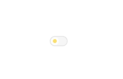
 Minimalist Light/Dark Mode Switcher
Minimal and functional theme toggle, beautifully designed for both light and dark modes.
11 months ago -

-
 Smooth Animated Toggle Switch Component
A customizable toggle switch with smooth sliding animation that provides visual feedback for on/off states, perfect for settings or preference controls.
10 months ago -
 11 months ago
 -
-
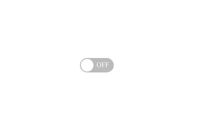
 Toggle Switch Button
A simple and accessible toggle switch button for implementing binary on/off controls in your web applications.
11 months ago -
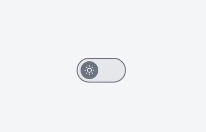 Minimal Light/Dark Theme Toggle Button
Minimalist design theme switcher with animated icons, perfect for modern web applications requiring dark mode functionality.
11 months ago -
-
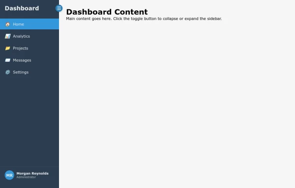
 Responsive Navbar with Collapsible Sidebar and Dark Mode Toggle
A fully responsive navigation system featuring a sleek navbar that transforms into a sidebar on mobile devices, complete with smooth dark mode toggle functionality for enhanced user experience.
10 months ago -

-
 Responsive Collapsible Sidebar Navigation
A clean, responsive sidebar navigation component with toggle functionality for modern web applications and dashboards.
10 months ago -
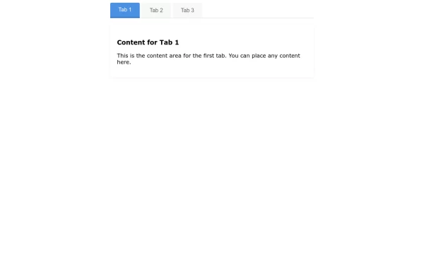 Interactive Tab Switcher Component
Minimalist tab switching interface with intuitive design, enabling seamless content organization and improved user experience.
11 months ago


Explore components by Tags
Didn't find component you were looking for?
Search from 500+ components