- → Aiden Mercer
- → Simple Tooltip Popover
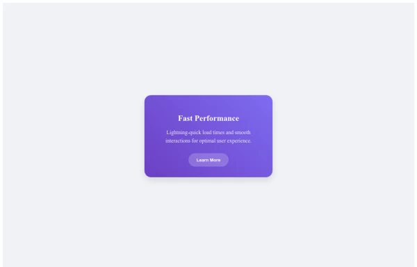
Simple Tooltip Popover
A clean and responsive popover component that displays additional information when users hover over a trigger element. Perfect for tooltips, user profiles, and contextual help.
This Example is contributed by Aiden Mercer, on 24-Mar-2025. It is responsive. similar terms for this example are popup,dialog

Author Aiden Mercer
Related Examples
-
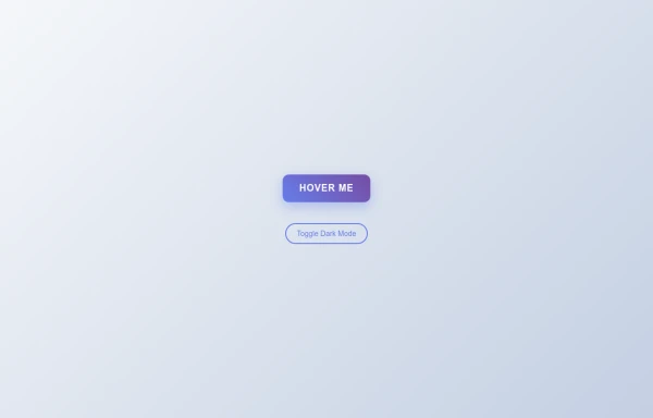
 Right Aligned Tooltip
A simple and customizable right-aligned tooltip component built with HTML and CSS. Perfect for displaying additional information on hover.
9 months ago -
 CTA Card
Stunning gradient service cards with smooth hover animations and interactive elements, perfect for showcasing features or services.
10 months ago -
 9 months ago
 -
 Flipping Card Animation
A stylish interactive card that smoothly flips to reveal content on the back when hovered. Perfect for showcasing product features or team members.
9 months ago -
 Tilted Gradient Button with Hover Animation
A responsive gradient button that tilts smoothly on hover with dark mode compatibility. Features smooth CSS transitions and gradient background effects.
6 months ago -
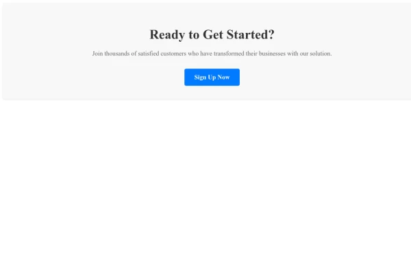
 Call-to-Action Card
Boost your conversions with this responsive CTA card. Features a clear headline, compelling description, and prominent button.
9 months ago -
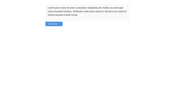 Expandable View More Button for Content Control
A customizable view more button that reveals additional content when clicked, perfect for managing long content sections without overwhelming users.
8 months ago -
 9 months ago
 -
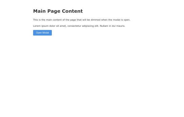 Responsive Modal with Overlay Background Effect
A sleek modal component that dims the background content to create focus on the active dialog, with smooth transitions and responsive design.
8 months ago -
 Button with Text Change on Hover Effect
A customizable button that changes its text content when users hover over it, providing an intuitive and responsive user experience.
8 months ago -
 Responsive Modal Popup with Overlay Effect
A responsive modal popup that works across all device sizes. Features a smooth fade-in animation, backdrop overlay, and close button for better user experience.
6 months ago


Explore components by Tags
Didn't find component you were looking for?
Search from 500+ components