- → Anonymous
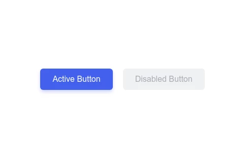
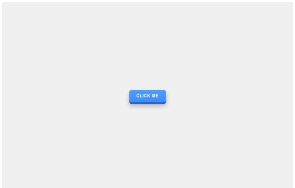
- → Disabled and Active Button State Compari...

Related Examples
-
 10 months ago
 -
 10 months ago
 -
 11 months ago
 -
 Sharp Corner Button with Sleek Hover Animation
A clean, modern button design featuring sharp corners and a smooth hover animation that enhances user interaction and engagement.
10 months ago -
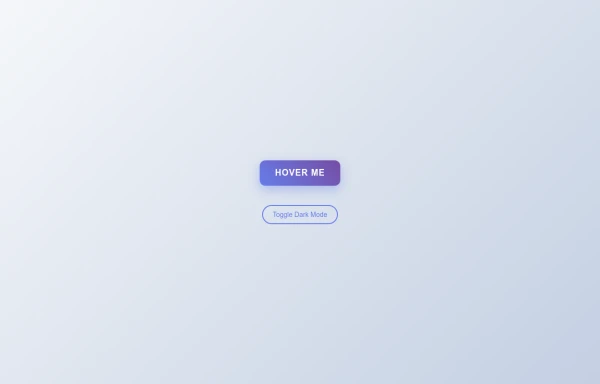 Tilted Gradient Button with Hover Animation
A responsive gradient button that tilts smoothly on hover with dark mode compatibility. Features smooth CSS transitions and gradient background effects.
8 months ago -
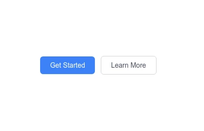
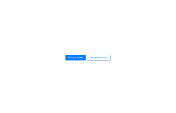 Primary and Secondary Buttons
A set of two buttons, typically used for primary and secondary actions on a webpage. Ideal for forms, confirmations, and user interactions.
11 months ago -
 3D Pushable Button with Dynamic Hover Effect
A stylish 3D button with realistic depth effect that responds to hover with smooth animations, creating an immersive user experience.
10 months ago -
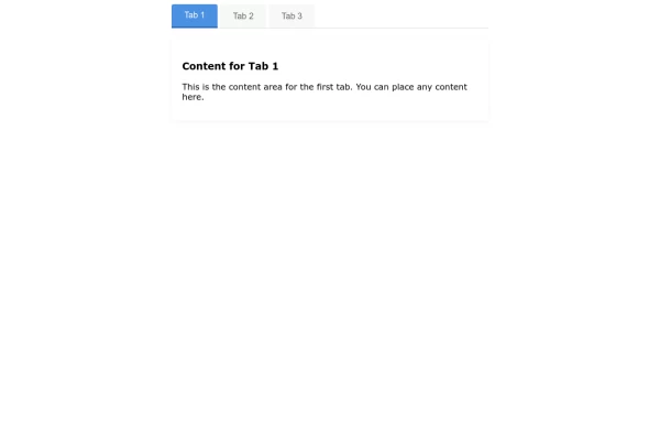 Interactive Tab Switcher Component
Minimalist tab switching interface with intuitive design, enabling seamless content organization and improved user experience.
11 months ago -
 10 months ago
 -
 10 months ago
 -

-
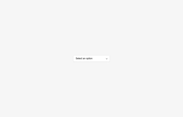 CSS-Only Hover Dropdown Select Menu
A lightweight dropdown select menu that activates on hover without any JavaScript. Perfect for clean navigation menus and form selects.
10 months ago


Explore components by Tags
Didn't find component you were looking for?
Search from 500+ components