- → Anonymous
- → Button Pair
Button Pair
This Example is contributed by Anonymous, on 28-Mar-2025. It is responsive. similar terms for this example are CTA Button,CTA,banner

Author Anonymous
Related Examples
-
 7 months ago
 -
 7 months ago
 -
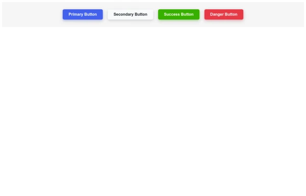
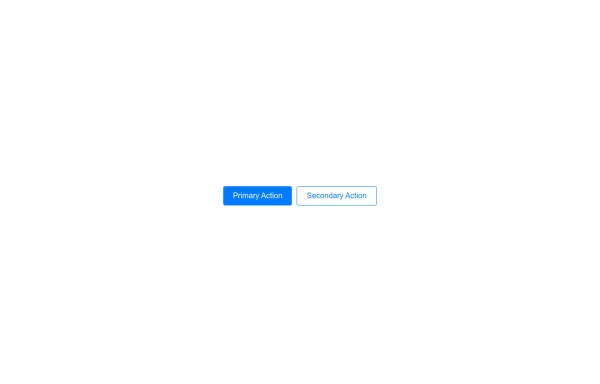 Primary and Secondary Buttons
A set of two buttons, typically used for primary and secondary actions on a webpage. Ideal for forms, confirmations, and user interactions.
8 months ago -
 7 months ago
 -
 Responsive Modal Popup with Overlay Effect
A responsive modal popup that works across all device sizes. Features a smooth fade-in animation, backdrop overlay, and close button for better user experience.
5 months ago -
 Sharp Corner Button with Sleek Hover Animation
A clean, modern button design featuring sharp corners and a smooth hover animation that enhances user interaction and engagement.
7 months ago -

-
 Accessible Modal Dialog
Create an accessible, responsive modal dialog with a simple setup. Ideal for alerts, confirmations, and custom content.
8 months ago -
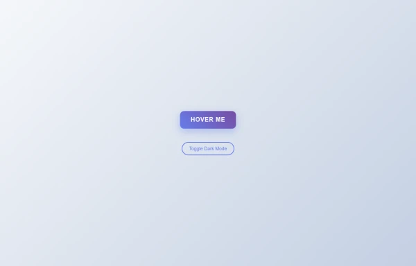 Tilted Gradient Button with Hover Animation
A responsive gradient button that tilts smoothly on hover with dark mode compatibility. Features smooth CSS transitions and gradient background effects.
5 months ago -
 7 months ago
 -
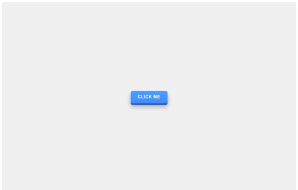 3D Pushable Button with Dynamic Hover Effect
A stylish 3D button with realistic depth effect that responds to hover with smooth animations, creating an immersive user experience.
7 months ago -
 6 months ago


Explore components by Tags
Didn't find component you were looking for?
Search from 500+ components