- → Anonymous
- → Input Error Notification Component
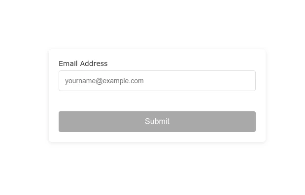
Input Error Notification Component
This Example is contributed by Anonymous, on 24-May-2025. It is responsive. similar terms for this example are caution,Toast, Snackbar

Author Anonymous
Related Examples
-
 Validated Email Input Field with Real-time Feedback
A clean email input field with real-time validation that provides immediate feedback to users when they enter a valid or invalid email address.
8 months ago -
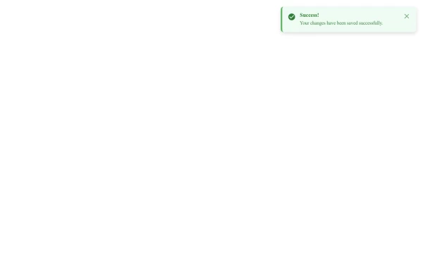 Fixed Top-Right Alert Notification Component
A responsive fixed-position alert that appears in the top-right corner of the screen, providing important notifications without disrupting user workflow.
10 months ago -
-
 11 months ago
 -
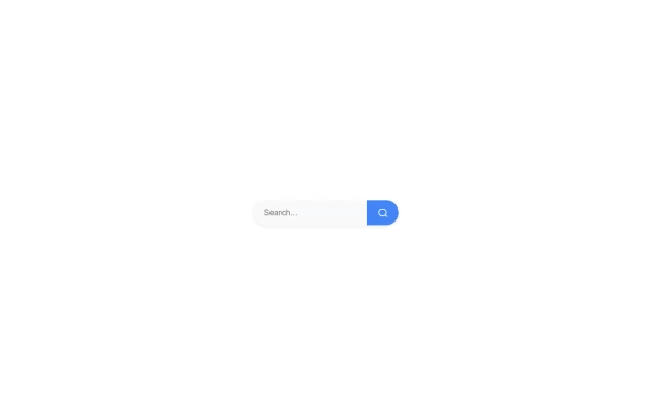
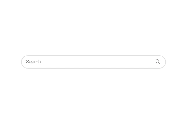 Responsive Search Input with Icon Animation
A clean, responsive search input field with animated icon and focus effects for enhanced user experience on websites and applications.
10 months ago -
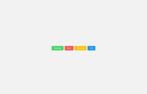 Customizable Toast Alert Component for Websites
A versatile toast notification component that displays temporary messages to users with various styling options including success, error, and warning alerts.
9 months ago -
 10 months ago
 -
 Closable Toast Notifications
A lightweight toast notification system that displays messages in the bottom-right corner of the screen with smooth animations and a close button for user dismissal.
10 months ago -
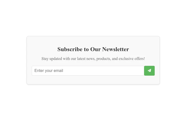
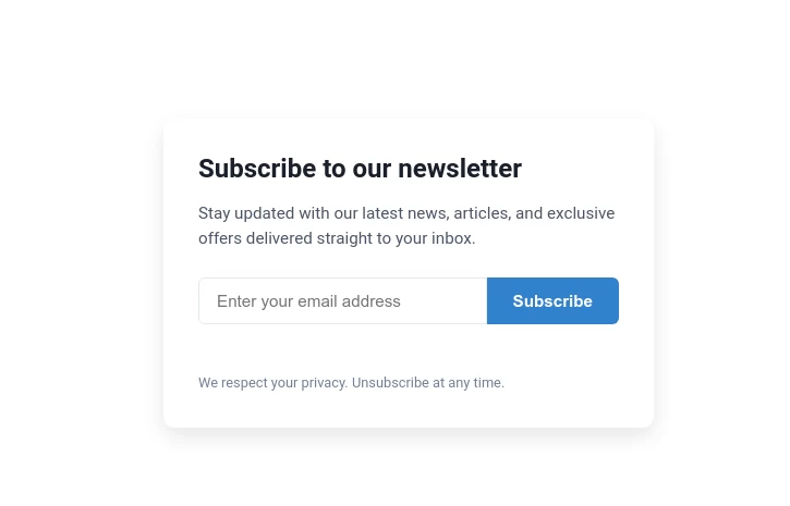
 Newsletter Subscription Form with Animated Success
Boost your email list with our user-friendly newsletter subscription form. Features real-time validation and a visually appealing success animation.
11 months ago -

-
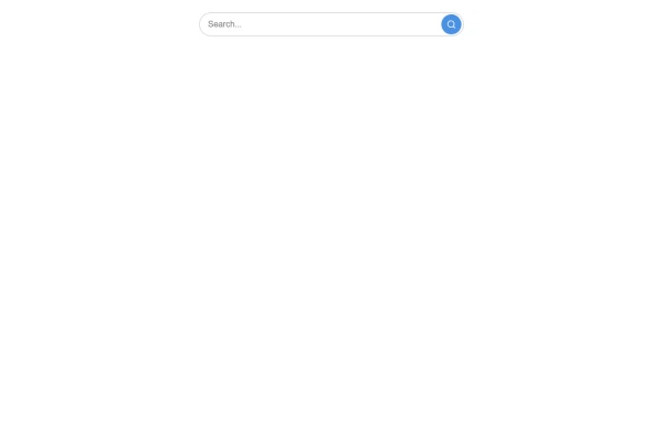 Responsive Search Bar with Button
A responsive search bar with an integrated button for enhanced user experience. Perfect for websites, applications, and dashboards.
8 months ago -
 11 months ago


Explore components by Tags
Didn't find component you were looking for?
Search from 500+ components